
10 Ocean Color Palettes No Designer Needed Just These Shades
There is a reason people feel instantly calmer the moment they step into a room decorated with ocean colors. It is not accident or coincidence. The human brain is wired to associate deep blues, soft seafoam greens, warm sandy neutrals, and moody teal tones with safety, openness, and rest. Ocean color palettes tap directly into that wiring and the results inside a home can be genuinely transformative. Rooms feel larger. Tension drops. Guests linger longer without quite knowing why.
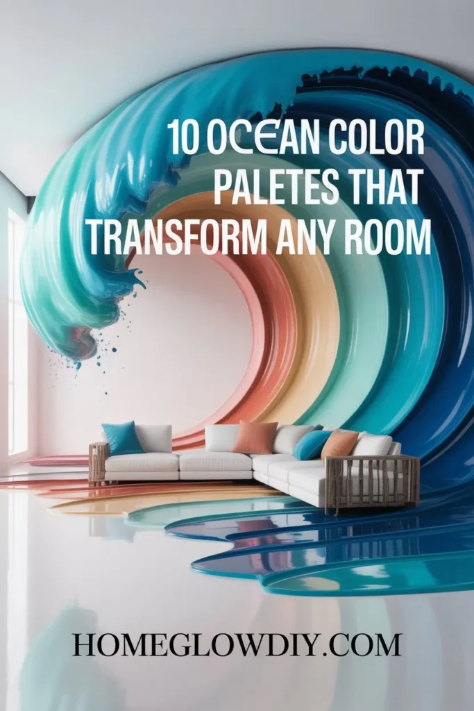
The problem most homeowners face is not wanting an ocean themed color palette. It is knowing exactly which shades to combine, which walls to paint, and how to avoid ending up with a room that feels more like a dentist’s waiting area than a coastal retreat. This is where most DIY decorators get stuck. They pick one blue, paint a wall, and wonder why it does not feel like the Pinterest image they saved. The secret is always in the combination of shades, not in any single color alone.
Before diving into the palettes, it is worth understanding one simple rule that separates ocean color schemes that feel cohesive and intentional from ones that feel random and cold. Every successful ocean pallet color combination follows the 60-30-10 rule. Sixty percent of the room uses a dominant neutral with ocean undertones, thirty percent uses a mid-tone ocean shade on walls or large furniture, and ten percent uses the boldest accent color for throws, cushions, artwork, and decorative objects. Keep that framework in mind as you explore each palette below and the whole process becomes remarkably straightforward.
Why Ocean Color Palettes Work in Almost Every Home
Ocean color palettes have a unique design advantage that most other color families do not share. They sit in a naturally harmonious range of the color wheel where blues, greens, and neutrals flow into each other without ever creating visual conflict. This means even imperfect combinations within the ocean palette family still tend to look intentional and pleasing. That built-in harmony is why ocean pallet colors are consistently the most searched home decor color category on Pinterest, Houzz, and Google year after year regardless of shifting design trends.
Ocean themed color palettes also have an extraordinary ability to work across different lighting conditions in ways that most bold color schemes cannot manage. A deep ocean pallet color like navy or stormy teal looks rich and cozy under warm evening lighting and fresh and expansive under bright morning daylight. That dual personality means you are never trapped with a room that looks wrong at a particular time of day, which is one of the most common complaints homeowners have about rooms painted in other bold color families.
Another reason ocean color palettes dominate interior design inspiration boards is their versatility across room types. An ocean pallet color bedroom creates the deep restful calm that sleep researchers consistently link to better quality rest. An ocean blue color pallet living room feels welcoming and spacious without sacrificing any sense of warmth or personality. Even a color pallet for ocean themed bathrooms transforms a purely functional space into something that feels like a genuine spa retreat. Few other color families deliver that level of versatility across every room in the house.
10 Ocean Color Palettes You Can Use Starting Today
1. Classic Coastal Ocean Color Palette for Living Rooms

The most universally loved ocean color palette for living rooms combines soft white, warm sand beige, and a medium coastal blue in a ratio that feels bright, airy, and genuinely inviting. For a specific ocean pallet color Sherwin Williams recommendation, Interesting Aqua SW 6220 paired with Accessible Beige SW 7036 and Pure White SW 7005 is one of the most reliably beautiful coastal living room combinations available. Paint walls in the sandy beige, use coastal blue on a single accent wall or large sofa, and layer pure white in curtains, trim, and decorative accessories. The result is a room that feels simultaneously relaxed, pulled together, and larger than its actual dimensions.
2. Deep Ocean Palette Color for Moody Bedrooms

A deep ocean pallet color bedroom is one of the most dramatic and rewarding interior transformations any homeowner can make. The key is committing fully to depth rather than diluting the palette with too many lighter tones. Combine navy blue, charcoal teal, and warm brass or gold as an accent metal for a bedroom that feels both rich and genuinely restful. For specific shades, Naval SW 6244 from Sherwin Williams is one of the most searched deep ocean pallet color bedroom choices for very good reason. It reads as a true deep navy in low light and reveals beautiful blue undertones in natural daylight. Pair it with crisp white bedding and natural linen textures to prevent the room from feeling heavy or closed in.
3. Sunset Ocean Color Palette for Warm Dining Rooms

A sunset ocean color pallet moves away from the expected cool blues and introduces the warm golden, coral, and amber tones that appear when ocean water catches the last light of day. This palette combines terracotta, warm peach, soft coral, and a grounding navy accent to create a dining room that feels incredibly warm and convivial in evening lighting. The sunset ocean color pallet works especially well in north-facing dining rooms that receive little natural daylight, as the warm tones compensate beautifully for the cooler ambient light. Use the terracotta on walls, coral in fabric accents, and navy in a statement piece like a sideboard, artwork frame, or dining chair upholstery.
4. Ocean Green Palette Color for Kitchen Refresh

Ocean green pallet color sits in the beautiful transition zone where blue ocean tones meet coastal vegetation and it is one of the most sophisticated and on-trend color choices for kitchen spaces right now. Think of the color of shallow tropical water over white sand, that specific soft blue-green that reads differently in every light. Evergreen Fog SW 9130 from Sherwin Williams captures this quality perfectly and is one of the most pinned ocean green pallet color kitchen shades of the past three years. Pair it with warm white upper cabinets, unlacquered brass hardware, and a white marble or white quartz countertop for a kitchen that feels both current and timelessly coastal.
5. Ocean Blue Color Palette for Small Bathrooms

Small bathrooms are where an ocean blue color pallet does some of its most impressive work. The reflective quality of blue tones interacts with bathroom lighting and fixtures in a way that genuinely makes small spaces feel more open and spa-like. For a small bathroom ocean themed color palette, combine a medium aqua blue on walls with crisp white tiles, chrome or brushed nickel fixtures, and natural wood accents in warm teak or bamboo tones. Mosaic Tile SW 6748 or Tidewater SW 6477 from Sherwin Williams are both excellent ocean blue color pallet choices for bathrooms because they have enough green in their undertones to feel fresh rather than cold in the typically limited natural light of a bathroom space.
6. Dark Ocean Palette Color for Home Office Walls

The home office is arguably the best room in any house to experiment with a genuinely dark ocean pallet color because the psychological effect of deep ocean tones on focus and creativity is well documented. Dark teal, deep blue-green, and charcoal navy create an immersive environment that reduces visual distraction and signals to the brain that the space is serious and intentional. Dark ocean pallet color walls in a home office work best when paired with warm wood furniture, warm white artificial lighting, and natural textures like linen, jute, and raw oak. Cyberspace SW 7076 and Commodore SW 6524 are both outstanding dark ocean pallet color choices that interior designers specifically recommend for work and focus spaces.
7. Ocean Colors Spray Paint Palette for Furniture Makeovers

Not every ocean color palette transformation requires painting walls. One of the fastest and most budget friendly ways to bring ocean pallet colors into any room is through furniture makeovers using ocean colors spray paint palette techniques on thrifted or existing pieces. A dated pine side table sprayed in a deep teal, a wicker basket painted in seafoam, or a set of picture frames done in a gradient from pale aqua to deep navy can completely shift the color story of an entire room without touching a single wall. When working with ocean colors spray paint pallet projects, always prime bare wood first, apply two thin coats rather than one heavy one, and finish with a matte sealer to prevent chipping on high-use surfaces.
8. Ocean Themed Color Palette for Open Plan Living Spaces

Open plan living spaces present a unique challenge for any color scheme because multiple functional zones need to feel visually connected without becoming repetitive. An ocean themed color palette solves this challenge naturally because of the wide tonal range available within the ocean color family. Use the lightest sandy neutral in the kitchen zone, step up to a soft coastal blue in the dining area, and deepen to a richer teal or navy in the living seating area to create a sense of flowing color progression that guides the eye through the space without any hard visual breaks. This graduated ocean themed color palette approach makes open plan spaces feel intentionally designed rather than accidentally assembled.
9. Color Palette for Ocean Themed Kids Bedroom

An ocean themed kids bedroom is one of the most enduringly popular children’s room concepts because it grows with the child in a way that purely novelty themes like cartoon characters never manage. A well-executed color pallet for ocean themed kids rooms combines a bright sky blue ceiling, white walls with painted wave murals or peel and stick wave wallpaper, sandy yellow accents in bedding and rugs, and a few deep navy touches in bookshelf backing or curtains to add depth and prevent the room from feeling too saccharine. This color pallet for ocean themed bedrooms works beautifully for children from toddler age right through the teenage years simply by swapping out accessories and artwork as tastes mature while the foundational palette remains.
10. Ocean Palette Color Sherwin Williams Full Room Guide

Sherwin Williams offers the most comprehensive and well-tested range of ocean pallet color Sherwin Williams options of any major paint brand, which is why their colors dominate both professional interior design projects and DIY home makeovers in this category. For a complete whole-home ocean palette using Sherwin Williams exclusively, consider this proven combination: Alabaster SW 7008 as the primary neutral throughout all hallways and ceilings, Aleutian SW 6241 as the main wall color in living and dining areas, Naval SW 6244 as the deep accent in the master bedroom, and Reflecting Pool SW 6486 as a fresh mid-tone for bathrooms and the kitchen. This four-color ocean pallet color Sherwin Williams system creates a home that flows beautifully from room to room with a coherent coastal identity.
How to Layer Ocean Pallet Colors Like a Professional Designer
Professional interior designers who work with ocean color palettes consistently use one technique most DIY decorators overlook: layering three distinct values of the same hue rather than combining multiple different ocean shades. Choose a light, a medium, and a dark version of the same base ocean color and distribute them across walls, large furniture, and accessories. A living room using an ocean blue color pallet layering approach might use pale powder blue on walls, medium coastal blue on a sofa, and deep navy on cushions and an accent table. The result feels cohesive and sophisticated because the eye reads it as one intentional color story.
Natural materials are the most powerful supporting element in any ocean themed color palette scheme. Driftwood, rattan, jute, linen, seagrass, and raw unfinished oak carry the warm sandy neutral tones that appear naturally alongside ocean water in coastal environments. Incorporating these materials into an ocean pallet color bedroom, living room, or bathroom grounds the color palette in a tactile reality that paint alone can never achieve. A room with beautifully chosen ocean pallet colors but no natural material texture will always feel slightly flat and staged. Add even one natural material element and the palette immediately feels more alive, more layered, and more genuinely coastal.
Artwork is the most underestimated tool in the ocean color palette decorator toolkit. A single large artwork featuring ocean imagery does two things simultaneously. It introduces additional tones from the ocean color family in a way that feels organic rather than deliberate, and it gives the eye a focal point that anchors the entire palette in the room. When selecting artwork for an ocean color pallet bedroom or living room, look for pieces containing at least one shade already in your wall color and at least one contrasting tone that adds something new. That visual connection between artwork and wall color is what makes a room feel truly designed.
Pro Tips for Using Ocean Color Palettes Without Making Mistakes
The single most common mistake people make when implementing an ocean color palette is choosing colors they love on a phone screen or paint chip and applying them directly to walls without testing first. Ocean pallet colors are among the most lighting-sensitive shades in the entire color spectrum. A shade that looks like a perfect soft seafoam on your phone can read as grey-green, blue-grey, or even purple-grey depending on your room’s specific light sources, window orientation, and the existing colors of your flooring and furniture. Always paint a large test patch of at least twelve by twelve inches and observe it at different times of day before committing to a full room application.
Undertones are the invisible architecture of every successful ocean color palette. Deep ocean pallet colors almost always contain either blue, green, or purple undertones that only reveal themselves when placed next to other colors in the room. A navy with purple undertones will clash against warm brown wood floors while a navy with green undertones will harmonize beautifully with the same floor. Before purchasing any ocean themed color palette paint, hold the chip against your existing flooring, furniture, and fixed elements like fireplaces and kitchen countertops to check undertone compatibility in your specific space.
Texture is the secret ingredient that separates flat and lifeless ocean color palette rooms from ones that feel genuinely rich and layered. The ocean itself is never one flat color. It is an endlessly shifting combination of reflective surfaces, matte depths, and translucent shallows. Bring that same textural variety into your color pallet for ocean themed rooms by combining matte painted walls with glossy ceramic tiles, rough linen cushions with smooth silk throws, natural jute rugs with lacquered furniture surfaces. That contrast of textures within the same ocean color palette makes every shade appear more vibrant and intentional.
Metallics are the finishing touch that elevates every ocean color palette from good to genuinely stunning. The right metal tone acts as a bridge between all the ocean pallet colors in a room and ties the palette together in a way that no additional paint color can achieve. For lighter and brighter ocean palettes featuring aquas, seafoams, and coastal blues, silver and chrome metallics are the natural choice. For deeper and moodier ocean palette applications featuring navy, dark teal, and charcoal blue, warm brass and unlacquered bronze create a beautiful tension against the cool ocean tones that feels incredibly sophisticated and intentional.