
20 Stunning Color Harmony Schemes for Interior Design
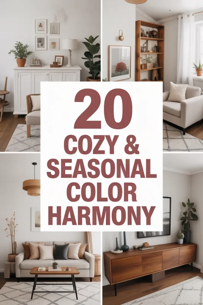
Color is more than just decoration it’s the soul of any space. The right color harmony can transform a dull room into a cozy retreat, a workspace into an inspiring environment, or a living room into a statement of elegance. Choosing the perfect color palette is not just about picking pretty shades; it’s about understanding how colors interact, the emotions they evoke, and how they reflect your personal style.
This guide explores 20 stunning color harmony schemes for interior design, offering practical advice, examples, and inspiration for every type of home. Whether you’re redesigning a bedroom, decorating a living room, or refreshing your kitchen, these schemes will help you create a balanced and beautiful space .
Understanding Color Harmony in Interior Design
Before diving into the 20 schemes, it’s essential to understand what color harmony is and why it matters.
What is Color Harmony?
Color harmony refers to the pleasing arrangement of colors that look balanced and feel good to the eye. Harmonious colors complement each other, creating a unified, aesthetically appealing space. In interiors, color harmony is key to setting the mood, defining areas, and reflecting personality.
Color Wheel Basics
The color wheel is a fundamental tool for creating harmony. It consists of primary colors (red, blue, yellow), secondary colors (green, orange, purple), and tertiary colors (mixes of primary and secondary). The main color harmony techniques include:
- Monochromatic – Variations of a single hue (light to dark shades).
- Analogous – Colors next to each other on the wheel, creating a serene and cohesive look.
- Complementary – Colors opposite each other, producing vibrant contrasts.
- Split-Complementary – One base color + two adjacent colors of its complement, balancing contrast and harmony.
- Triadic – Three colors equally spaced on the wheel, for a lively and dynamic palette.
- Tetradic/Double Complementary – Two pairs of complementary colors, creating rich and complex schemes.
Psychology of Colors in Interiors
Colors affect emotions, energy, and even behavior. Understanding color psychology helps you choose palettes that match your intended mood:
- Blue: Calm, serene, and perfect for bedrooms or study areas.
- Green: Refreshing, natural, and suitable for living rooms or kitchens.
- Yellow: Cheerful and energetic, great for dining rooms or creative spaces.
- Red: Bold and stimulating, ideal for accent walls or dining areas.
- Neutral tones (white, beige, gray): Provide balance and versatility, forming the backbone of many palettes.
How to Choose the Right Color Scheme
Selecting a color harmony scheme is more than just liking certain shades. Consider:
- Space and Lighting – Natural light affects how colors appear. South-facing rooms often handle bold colors better than dim north-facing spaces.
- Existing Furniture & Decor – Make sure your palette complements or contrasts harmoniously with your furniture, flooring, and artwork.
- Function of the Room – Relaxing spaces benefit from cool tones, energetic spaces from warm tones.
- Personal Style – Classic, minimalist, modern, boho, or eclectic preferences guide your choices.
20 Stunning Color Harmony Schemes
Below are 20 color harmony schemes with details on how to use them effectively in interiors.
1. Soft Neutrals (Beige, Cream, Taupe)

- Best For: Living rooms, bedrooms
- Mood: Calm, cozy, minimalist
- Tips: Use layered textures like woven rugs and linen cushions to keep the palette interesting.
2. Coastal Blues and Whites

- Best For: Beach-style living rooms, bathrooms
- Mood: Relaxing, airy, fresh
- Tips: Combine navy, sky blue, and crisp white with natural textures like jute or driftwood.
3. Earthy Greens and Browns
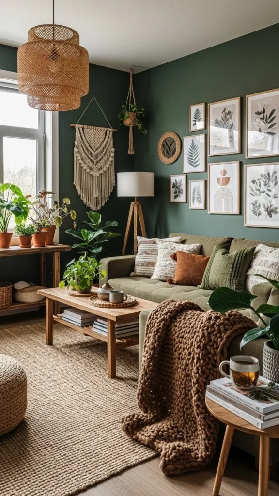
- Best For: Study rooms, kitchens
- Mood: Natural, grounded, organic
- Tips: Add plants and wooden furniture for a seamless indoor-outdoor vibe.
4. Bold Jewel Tones (Emerald, Sapphire, Ruby)
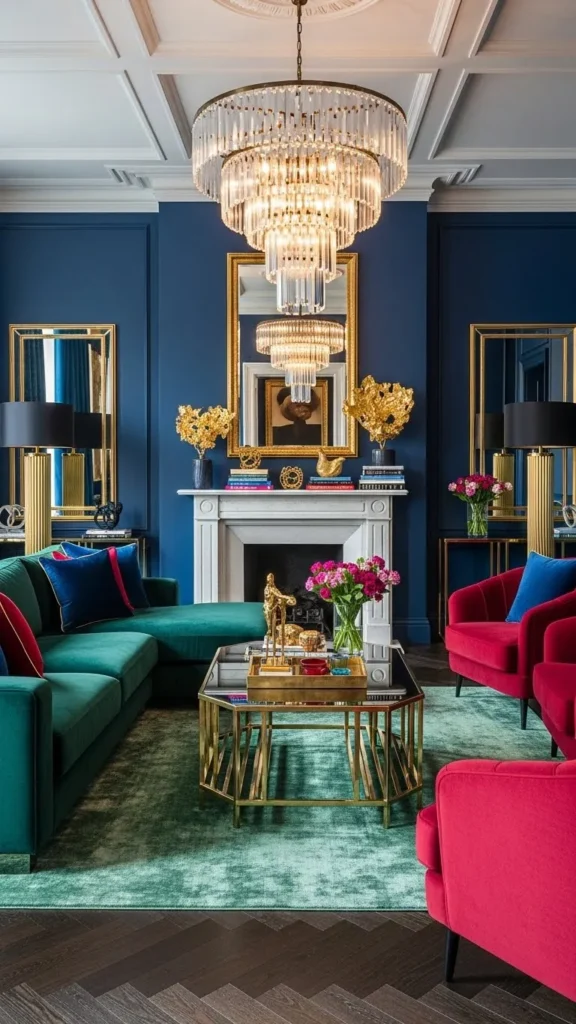
- Best For: Statement living rooms, dining areas
- Mood: Luxurious, vibrant, dramatic
- Tips: Balance bold tones with neutral walls or flooring to avoid overwhelming the space.
5. Soft Pastels (Blush, Mint, Lavender)

- Best For: Nurseries, bedrooms, creative studios
- Mood: Light, playful, cheerful
- Tips: Mix pastels with whites or light wood furniture to keep it airy.
6. Monochromatic Grays

- Best For: Modern apartments, offices
- Mood: Sophisticated, sleek, timeless
- Tips: Vary shades of gray and mix textures like velvet, concrete, and metal for depth.
7. Warm Autumn Palette (Rust, Mustard, Olive)
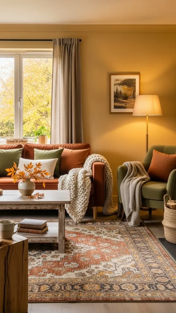
- Best For: Cozy living rooms, reading corners
- Mood: Warm, inviting, seasonal
- Tips: Add warm lighting and natural fibers to enhance comfort.
8. Black, White, and Gold

- Best For: Glamorous living rooms, entryways
- Mood: Chic, elegant, luxurious
- Tips: Gold accents in lighting, frames, or furniture elevate the black and white base.
9. Minimalist Whites and Soft Woods

- Best For: Scandinavian-style interiors
- Mood: Clean, airy, simple
- Tips: Introduce greenery and subtle textiles to avoid sterility.
10. Vibrant Tropical Palette (Turquoise, Coral, Lime)
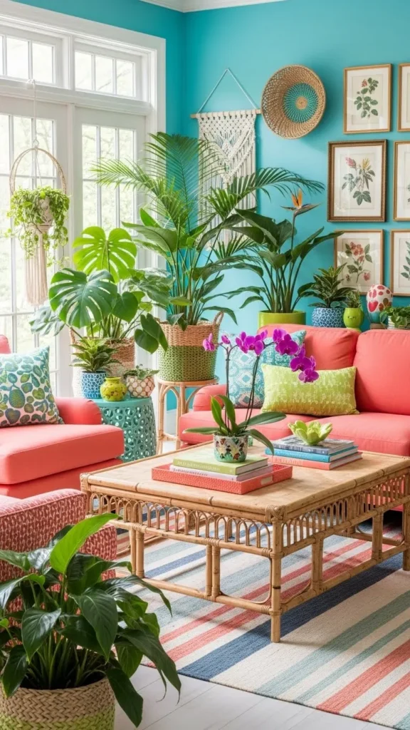
- Best For: Sunrooms, patios
- Mood: Energetic, exotic, fun
- Tips: Keep the base neutral to let vibrant accents shine.
11. Lavender and Sage

- Best For: Bedrooms, bathrooms
- Mood: Calm, soothing, restorative
- Tips: Pair with light wood and soft textiles for ultimate relaxation.

- Best For: Modern living rooms, bedrooms
- Mood: Romantic, balanced, trendy
- Tips: Use blush as accents in cushions, artwork, and curtains.
13. Terracotta and Cream

- Best For: Boho-style living rooms, kitchens
- Mood: Warm, earthy, rustic
- Tips: Add plants, textured rugs, and natural ceramics for depth.
14. Teal and Mustard
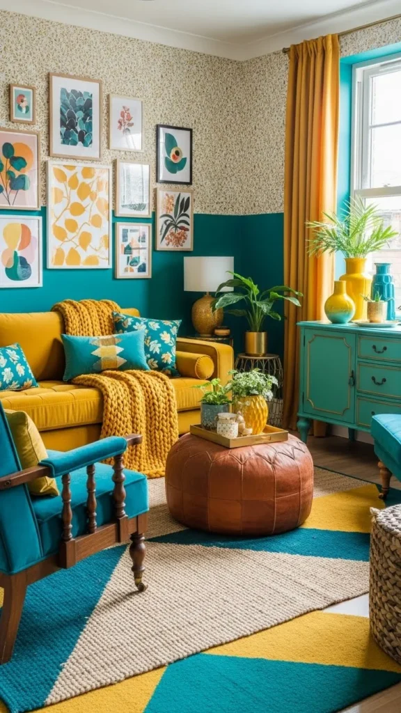
- Best For: Eclectic interiors, living rooms
- Mood: Bold, vibrant, playful
- Tips: Balance with neutral walls and metallic accents.
15. Soft Pink and Gray

- Best For: Bedrooms, offices
- Mood: Feminine, calming, sophisticated
- Tips: Add mirrored or metallic accents for subtle glam.
16. Charcoal and Burnt Orange

- Best For: Modern kitchens, home offices
- Mood: Bold, cozy, contemporary
- Tips: Pair with natural wood for balance.
17. Aqua and Sand

- Best For: Bathrooms, coastal living rooms
- Mood: Refreshing, serene
- Tips: Introduce shells, driftwood, and linen textures.
18. Olive and Terracotta
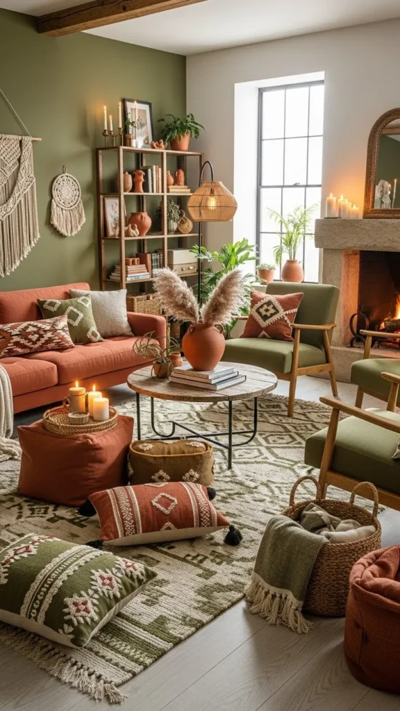
- Best For: Bohemian or rustic interiors
- Mood: Earthy, cozy, inviting
- Tips: Add patterned textiles and pottery for visual interest.
19. Plum and Cream

- Best For: Bedrooms, feature walls
- Mood: Romantic, dramatic, elegant
- Tips: Use plum in furniture or accent walls, cream for walls and textiles.
20. Sage, Gray, and White

- Best For: Modern minimal interiors
- Mood: Calm, airy, sophisticated
- Tips: Mix materials like stone, wood, and metal for texture and balance.
Applying Color Harmony in DIY Projects
Using these palettes in DIY projects can elevate your space without breaking the budget. Ideas include:
- Paint Accent Walls – Try one dominant color with complementary accents.
- Textiles – Cushions, curtains, and rugs in harmonized colors.
- DIY Artwork – Create abstract paintings or wall panels using your palette.
- Furniture Makeovers – Paint old furniture in complementary colors to refresh a room.
Common Mistakes to Avoid
- Overloading colors – Stick to 2–3 main colors plus accents.
- Ignoring lighting – Test colors in different lights before committing.
- Clashing patterns – Ensure patterns reflect your palette for cohesion.
- Forgetting balance – Bold colors need neutrals to prevent overwhelming the space.
How to Refresh Your Home Using Color Harmony
Even small adjustments can dramatically improve your space:
- Swap out cushions, rugs, or curtains in your chosen palette.
- Add accent furniture pieces in complementary tones.
- Use wall art or DIY décor items that reflect your color harmony.
- Incorporate plants for natural color and texture.
Conclusion
Choosing a color harmony scheme is one of the most impactful ways to transform your home. The right palette not only enhances the mood and aesthetics but also makes your interiors.
Whether you love soft neutrals, vibrant jewel tones, earthy hues, or playful pastels, these 20 stunning schemes offer inspiration for every room, style, and personality. Experiment, mix, and match these palettes, and watch your space come alive with color and harmony.